STORY
I was approached by the developer to design a logo for a new multi-use urban development project consisting of both small residential units and commercial retail space. The goal of the logo was to design a clean, custom identity for marketing and signage. Both the design of the building and the design of the logo were inspired by offset and vertical stacks of books. The stacked book concept was representational of both the multiple levels of the building and also of the students and young professionals at the nearby University of Washington growing their knowledge and skills.
Contributions
Logo Design and production
Color Studies
INSPIRATION
These conceptual building exterior renderings by Johnston Architects, PLLC., showcase how the design of the building is inspired by offset and vertical stacks of books. The Stax identity project aimed to continue with the inspiration of these book stacks and building attributes and incorporate them into the design of the logo.
CONCEPTS
Quick hand-drawn brainstorm sketch concepts, some of which were later converted to digital.
Logo ideas refined to digital monochromatic concepts
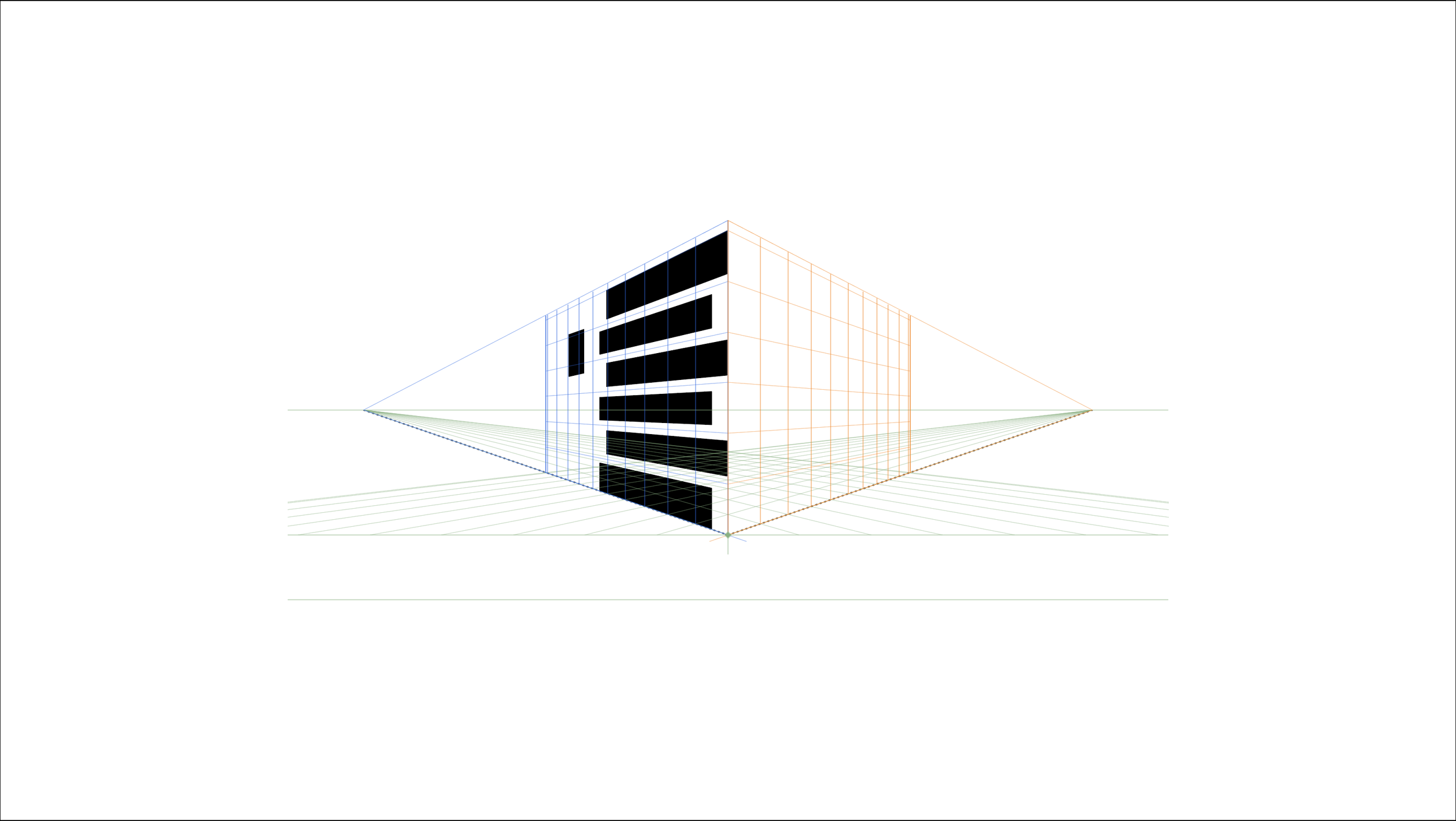
An example of digital perspective construction lines for accurately crafting the logo’s symbol
Final direction with monochromatic logo concepts for selection.


